To have a daily painting emailed to you every day, please enter your address below.

Enter your email address:

Delivered by FeedBurner

Thursday, March 31, 2011

Blue Green Still Life


This was one of those things - you get the idea sort of wholly formed in your head and you almost break your neck to get it down. I have been thinking more about the full/empty idea, about crowding or stacking and contrasting that with empty space. Also, that format can be a vehicle for strong color relationships, which if they are successful, could carry the painting alone. Then there is the question of the ratio of light to dark (Peggi Kroll Roberts!) who says she tries to keep it 1/3: 2/3 dark or light - but what if it were all dark? Or all light? Or all saturated, etc. Justin Clayton did a winter landscape recently that was so uniformly dark as to not be there except for the pale moon. Very melancholy, I loved it. Very Albert Pinkham Ryder. In this one, anyway, I tried to crowd and isolate and also to let the light source be the green cloth. oooo I am in love with permanent green light.

Wednesday, March 30, 2011

Little Begonia

More of my grey/yellow/brown paper behind this plant, experimenting with brighter clearer color next to lesser color, etc.

Monday, March 28, 2011

Wide Still Life

I feel like this is a bit of a breakthrough painting, even though there some questionable parts... It was great to play with the composition and to bend it to my will so to speak. I wanted to have a lot of space and a single unity of forms, and have it seem natural. And also, I wanted to use the pink as weight. Another thing I discovered, I am holding my brushes up close to the ferrule! I saw a great PBS documentary on the Taos painters, Victor Higgins and all those guys, and they were painting by holding their brushes almost at the ends. I knew this of course, but I didn't realize I had such a choke hold on my brushes. So today I backed way down the handle. It's a good thing I think, because you have to put the paint down differently, more of a smack and less distinct edge. Oh yes, and this painting is gigantic - 15 inches wide!

Sunday, March 27, 2011

Still life with Kiwi

Still on the full/empty theme: if "all things are understood by means of comparison", then can the painting be made to work with crowded forms and empty space? Could the crowding even go in the middle - dead center - with the space surrounding? Lots of ways to go with this one.

Saturday, March 26, 2011

Still Life with Macho Chayote


Another grocery store adventure: there are two kinds of chayote squash apparently, the smooth green one and then the other one, just the same except for the millions of yellowish spines that grow out of the skin, making a sort of halo around it so it looks velvety from 10 feet away. And it is called, no kidding, macho chayote.

Friday, March 25, 2011

Radish Finale

This is the 1812 Overture of Radishes, with all canons blazing.

Thursday, March 24, 2011

Radishes in a Blue Bowl

These are now senior radishes and getting a little milky looking, but they are still kicking.
For the leaves I used my now most favorite green family, cerulean blue and cad yellow light, with additions of other stuff when necessary. The greens from cerulean are luminous but not whorish. You can get some exquisite chartreuses.
About working in a series: it is much easier for me to learn if I have some repetition. Everything builds on itself and the momentum is fun and exciting. Also, I need to learn the form before I can relax (if I have ever relaxed) and pay attention to other important stuff. Anyway, thank you for a positive radish reception.
Several people have asked about the boxes - they are all origami and easy as pie. You need a bone folder and paper, and Bob's your uncle. An unsharp knife would probably do for the bone folder. If anyone is interested in having the pattern, I will see if I can get my sister to find it and I think I can email it to you in a PDF. But they are so much fun that you are tempted to quit painting and make boxes for the afternoon.

Tuesday, March 22, 2011

Radishes in Green Box


More radishes. I have a book binding sister who taught me how to make origami boxes, so I made a few from both plain and patterned paper to use for containers, and also because they are NOT ellipses.

Monday, March 21, 2011

Radishes on Plaid Napkin


These radishes are on another thift store napkin, a large plaid. I have been in love with plaid for years, although wearing it makes a girl feel like a baby tractor. Painting it is a different story. I think Alice Neel does it about the best it can be done, sorry Lucien, because the plaid just comes alive and is so impertinent! I have a piece of pink and orange plaid in the studio that I haven't been able to paint well ever, and I am thinking this napkin will let me learn by degrees. This one is a very simple plaid, so that is helpful. Also, I used a different family of greens: pthalo blue, cad yellow light, cad red, white and sometimes a mixed black (ultra. blue and burnt umber). Sometimes those pthalo greens are so harsh and artificial looking, but it might have to do with the other dominant colors in the painting as well as other stuff I don't know yet.

Sunday, March 20, 2011

Radishes on Checked Dishtowel

Radishes still robust today and they really are this red. I bought them at Central Market, so they are very uptown vegetables. I also went to the thrift store yesterday scouting for patterned fabric and found some good napkins and dishtowels, and that always makes for an exciting painting session, when you have new things to paint. In this little series I want to use different families of green so I can learn 'em. These two so far have all been cad yellow mixed with black primarily, with other stuff added, ultra. blue, some cad red light. Working in a series is just so helpful! You get on friendly terms with the parts and can relax.

Saturday, March 19, 2011

Radishes on Yellow


Radish triage: separate your paintable radishes into a few bunches, give them a quick cool rinse and pop them into 3 separate plastic bags, then into the fridge. When ready to paint, (palette scraped and ready, paint laid out, etc.) take out one bag and plop it down and GO. You have about 20 minutes before the radishes bleach out to a cadaverous pink. As soon as the painting is finished, rinse the radishes put them in the bag, then back to the fridge. Take out another of the first set of radishes and start on painting # 2. And so on. If you make it to the second day, your radishes will all be dewy and fresh. Moisture is everything.

Friday, March 18, 2011

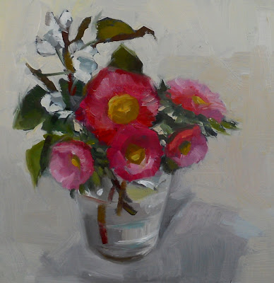
Small Bouquet


Today I played with edges until nothing worked and then I was really cranky and just wanted to get a showable painting, to hell with the fun. In this one, I am pleased to say I managed not to overwork the pear blossoms (very small white bits). Also, I was encouraged by my stumbling on a perfect almost invisible grey in my last flower painting and I worked it out again today to imprint it on my brain before I forget it. But of course, it was all different this time.

Thursday, March 17, 2011

Full and Empty


This was an exercise using the execrable ellipse! Also it is my entry for this month's challenge at Some Texas Artists Like to Paint. The theme, which was my choice, is full/empty ( was I insane?) but there are some great paintings done by the group. To see them, click

Wednesday, March 16, 2011

Daffodils

I overworked this one, but here it is nevertheless. I liked working with the yellows. So many luminous shades of it were there, some just a touch to the green or red side and some just blaring and honking yellows straight from the tube. Also I had some success with the grey in the upper half --- I mixed many of them and used an alarming amount of paint -aaugh!- but I got it finally. ( You have to take your triumphs where you can.)

Tuesday, March 15, 2011

Challenge, White Cup

This is my entry for this week's challenge, a white cup on patterned fabric. Click here to go to Daily Paint Works site, then click on challenges, then on the cup challenge. Lots of fun things!

Monday, March 14, 2011

PKR Exercise, Bouquet


I had a long painting day today but no survivors. The above painting is another exercise in establishing values from Peggi Kroll Roberts.

Sunday, March 13, 2011

Head, Study

On the Abe Lincoln challenge site I saw that several people had used the " Zorn palette", which I had never heard of, but is in face black, white, cadmium red and yellow and that's all...I didn't think you could get so much out of two colors and black and white! The painting below is my PKR painting, again with the value thing: darker values for the flowers, and more color and light for the background.


Saturday, March 12, 2011

Wide Bouquet

In this first one, I worked at getting the darker values of the flowers, particularly that purple one which is tipped down. I had trouble with this today for some reason, I have done these asters lots of times, no trouble. Who understands these things. Today I made a tight bouquet in another vase and put the leftover flowers in this vase so they wouldn't die, and of course, this one was the more interesting. I am sort of all over the place now with brushes and color and everything, those PKR exercises have derailed me a bit. But I expect to coalesce eventually.


And here is a study for my non painting amigos who are following the blog and wonder what, what is she doing all this for, is she crazy? Value or tone (used interchangeably) is the darkness or lightness of a color. If you paint it correctly, the form looks real and the eye sees it as three dimensional when really it is a flat two dimensional surface. Painting realistically is visual trickery, so best to know all the tricks. An example of this: on a sunny summer day in Texas, the sky will have a lighter value at the horizon where sky and land meet and a darker value as you go up. Another: the pears above have a light source coming from the left, so the area of lightest value is the first area the light hits. The area most hidden from the light will have the darkest value. With one value, which I didn't think to do, the form is completely flat. Two values begin to round it out, three round it more and you can begin to show reflected light (light reflected back up onto the bottom of the pear from the table or another neighboring form), and four values - well, I am not sure what four values gets you, which is why I am doing these exercises. There are actually many more existing values in all forms than you can get down in a painting. Putting them all in is impossible and ends in chaos. You have to learn to consolidate and edit values for the end result to be strong - for a strong painting, that has clarity. ( I am reminded here of Mortimer Adler's essay on Beauty, in which he writes there are three essential requirements for beauty: clarity, integrity and harmony of proportion. Do not know myself if this is so, but an interesting idea.)

Friday, March 11, 2011

Red Pansies


Today I did not do a value plan before painting, I spent some time after the drawing stage identifying similar values and blocking in the darkest ones with a wash. I did this one above quickly without too much trying to get it right. I also took one of the dvd covers that had a painting on it (Patricia Kroll Roberts) and smacked it down in front of the set up so I could refer to it. After I finished this one, I took a nap. Then I set up the second painting (top, above) and speedily dispatched it. I am becoming aware of lots of different things in this experience, things other than value patterns, such as how PKR gets that luminous color. I can see it is a combination of many things - for instance, when and where to use bright pure color and color very diluted with white. I am not familiar enough with it all yet, but I can see it from here.
Tomorrow I will have a little value demonstration for the amusement of my non artist friends and family.

Thursday, March 10, 2011

PKR Exercise, Bowls


This was a funny one -- I liked the value drawing painting better than the real painting, and I think primarily because the values in the top one are not dark enough to hold the painting together, and they DO hold it together in the grey one. Although I DID match my values pretty well.... I will give this another attempt tomorrow when I have fresh eyes.

Wednesday, March 9, 2011

Abe Lincoln Sort of Smiling


Of course, it's Abraham Lincoln, who is sort of smiling instead of looking so stern, but I thought, why not let him smile? So I left him happy. This is for a painting challenge, to see what everyone else has done and they are wonderful and hilarious, click on dailypaintworks.com and then click on challenges, scroll down.
The paintings below are Peggi Kroll Roberts exercises, still about changing black and white value paintings to color. I had some really fun painting today, I am starting to see it better. Also I am completely loving eliminating detail! But I do have to police myself because my inclination is to get it in there and I have bouts of confusion, such as, how am I going to reduce all that info to one mass? And then voila, it's no problem, you find the lowest common denominator and slap it down. Miraculously, the painting reads perfectly (I am not mistaking this for being a perfect painting). The best part, though, is that when I went to tackle Lincoln, which I was nervous about, it was much easier - as a matter of fact, it WAS easy to see the blocks of value that make up the planes of his craggy sweet face. Thank you, Peggi Kroll Roberts.


Tuesday, March 8, 2011

PKR Exercise, Sardine Can


Again, this Peggi Kroll Roberts exercise requires a value study in 3 values from the 10 swatch scale, but I let myself have 4 of them. Then in the second painting you match the color value to the grey value, hence the spots of color on the first painting. Detail is absent so you can just concentrate on the form's values. The result is not very glam, I know, but it's a really fun and exciting exercise! I wanted to have the ratio 1/3 light to 2/3 dark. I feel my perceptual tectonic plates shifting. I can see that this approach more easily produces a painting with all the relationships clearly established, and this gives it immediate clarity AS A WHOLE. Understanding this is a big leap, I think. For moi.

Monday, March 7, 2011

Marshmallows and Peppers

This top painting is my daily painting, very small, and I was just trying to have some quick fun after slogging away on the Peggy Kroll Roberts exercises from her DVD on value plans and changing value to color. The exercise paintings are below, the black and white one has only three values from a ten swatch value scale and the colored one matches (sort of) the color to the value of the grey painting. You can see the colored spots of paint on the grey one -- I was trying to figure it out. I think it is a very valuable lesson! Pun. So clever, I didn't see it coming.
I think this exercise sort of bends your brain around to more accurate evaluation of values, and therefore, more better paintings. Apropos of nothing, I learned a new word recently: bashment. It is slang, my favorite, and means loosely, wickedly enticing. So you could be wearing a bashy dress for instance ( any form of the word is acceptable) or drive a bashment car. Also, one could make bashment paintings if one could get those values down.


Sunday, March 6, 2011

Sandy

I have been doing Peggy Kroll Roberts exercises and nothing is post worthy, so here is a kitty.

Saturday, March 5, 2011

Pink Cake

In addition to the flower pastry, I bought this slab of pink cake at La Fiesta. It is a Pepto Bismol pink, like no other.

Friday, March 4, 2011

Plums, DPW challenge


I finally got it done completely honestly, no fudging. Each stroke had freshly mixed paint. A great exercise. I think the paint itself looks more vigorous. This is my entry for the Daily Paintworks Challenge. To see what everyone else has done, click here, then click on the challenge for this week.

Thursday, March 3, 2011

Mexican Pastry

It was my intention to do this according to the rules of the DPW challenge, mixing fresh color for each brush stroke, but the pastry was so intricate that I soon fell off the wagon. I have been mixing color with the palette knife lately - big batches of the general color necessary - rather than mixing only with the brush. I think the color is better when mixed with the knife, then small adjustments are mixed with the brush from that batch. The color seems to retain its strength better, each application of it. Anyway, I guess this new idea blew out my organizational neurons on this exercise, so I'll have to try again. I do like the feel of the background though, laid in with a large brush and slight color variations.
This pastry is made with just pie crust with a colored bit in the middle. So innovative.

Wednesday, March 2, 2011

Cyclamen on Dark Blue


My pink cyclamen will not come forth with buds, it is just all leaves. So much for plant rehab at my house. I still have hope, though, but in the meantime, the white ones will do. I did pay attention this time to the warm temperature of the whites, just getting familiar with the range. I would like to do one where the background is almost the same value, or even actually IS the same, as the blossoms, with just temperature change, so that the flowers are just barely there.

Tuesday, March 1, 2011

Ikea Bowls

I finally found a sheet of paper that is exactly the color I wanted, and it is under this set up:
a grey that is yellowish, but not brown and not red. I want to play with some color against this grey and see what I can do. It also has some big chunks of other stuff in in, gold foil and shreds of fiber sticking out, but it's crawl, walk, run in this rodeo. Also, I want to make things work abstractly using realistic forms, I find this idea so exciting....