To have a daily painting emailed to you every day, please enter your address below.

Enter your email address:

Delivered by FeedBurner

Tuesday, July 24, 2012

The Wall Sconce


This was painted from a photo I took from an iPhone, I think the first picture I ever took from one. I was sitting on the bed in a hotel room and the wall sconce was just behind me.
That camera is a wonder, I was stunned, as can be seen.  This is what I learned from this painting: paint the entire eye socket flat in the darkest body tone and lay the shapes of the lids, iris, whites,etc. into the dark shadow paint.  Because I had to contend with those damn glasses, and because the glasses come last, by the time I got to painting them I could see I had misplaced one or the other eye slightly and so I had to wipe and repaint.  I painted lots of eyes...and the best ones were laid in over the dark tone.  The ones I painted piece by piece were not as integrated into the paint.  I have known this about painting over the dark for the eye socket, but I was not completely sold on it.  Now I'm a believer and will never never backslide.

Monday, July 23, 2012

Nose Kiss


Happy belated birthday to Jill W. with love.

Sunday, July 22, 2012

Maggie


Um...been a while since I posted, but I have been painting and reading and organizing my wits.  Nothing much seemed post-able, so I stepped out from under that pressure for a bit and just kept plodding along.  This is a commission for the family in Dallas who rescues sick dogs and gives them the Mayo Clinic level of care.  They then live in a dog paradise of fun, food, clothes, jewels and  extravagant  canine experiences.  I think the pack is now up to about 8.  In spite of their advantages, none of the dogs is spoiled.  Elizabeth Quintero, I salute you.

Thursday, June 21, 2012

Peach Study #8, Free Peaches on Green Paper


These are not glam super market peaches, but free peaches from a neighbor's tree. Problems are the same though, and they are, as my friend and painter Lorraine Shirkus says:  the values are difficult to see because the dark coloring of the peaches can occur in the light and the light coloring in the shadow side.  You have to hold that in your head and also keep the understanding of where the light is hitting and then I think, not care and see how it ends up.

Wednesday, June 20, 2012

Cherries in a Gold Box


Peach interregnum.  These cherries are in an origami box made from gold cardboard.


Tuesday, June 19, 2012

Peach Studies 6 & 7, White and Black


I guess ----- the top one is under exposed, because the peaches are really on a white cloth, and yet, against the second one, on black, they don't seem so far apart. That bright spotlight does burn out the color though (on the black) where the light most directly strikes the surface.  Today on my early morning bike ride I came across a table in a drive way with plastic bags full of tiny peaches -- with leaves! - and a sign that said, Free.  So now I have plenty, with stems AND leaves. So exciting.


Wednesday, June 13, 2012


I am trying to find  a new way, a different way to put the paint down.  I don't know what way this is, I just need a form I am familiar with that doesn't present any new learning curve, if only that could be true, so that I can practice with the paint itself.  Almost to the end of these  peaches though, their little leaves are wet and soggy from refrigerator condensation and the peaches themselves are spongey.

Monday, June 11, 2012

Peach Study 3, On Red


I set this up on purpose with everything darkish and hot, just to explore.

Sunday, June 10, 2012

Study2 of Peaches on a Wrinkled Napkin


I swear the  darks on these peaches are so deep a red/brown that they are almost black.
And here is a link to a story about Robert Rauschenberg and his famous erased De Kooning drawing: click here.

Saturday, June 9, 2012

Peach Study 1


I have a slew of these peach studies coming.  They are not very thrilling, just some of the requisite slogging necessary for progress. To compensate I will offer this interesting anecdote: Renoir once had a side job painting religious scenes on Venetian blinds for Christian missionaries to use in the tropics in their conversion of natives.  That is a pretty good story (true), I may have made a mistake and started at the top.

Friday, June 8, 2012

Mugshot 60


This is the head of one of my favorite models, a boxer. She is overwhelmingly majestic.  I did this in a class with Jennifer Balkan, another timed painting, and I had a couple of bad starts so had to wipe and then very little time left to get it down, hence the thin paint. I wonder if there is a moral to this story.  Occasionally a very restricted situation forces me to use some hidden resource.  Certainly I am in a panic state when that happens and I won't be choosing to be there if I can help it.  If only I could get there without suffering for it. I'm against suffering.

Thursday, June 7, 2012

Gomez


This is a little worried Chihuahua sitting on a wildly patterned couch. And -- he is sort of smiling.
Impossible to resist painting it, I practically tore the photo out of a student's hand.  She did a very nice painting herself of  another shot of Gomez, which I will post when I get her permission.

Wednesday, June 6, 2012


This is a real mugshot from a Florida jail.  I thought this boy was so beautiful. I have painted him before, but still....I always think, now I might know a little more and be able to paint him better.

Tuesday, June 5, 2012

Mugshot 57: The Lessards


OOOOH, I have been computerless for some time, odd how everything becomes so quiet when your computer isn't working, like the world has stopped and I guess, really that world HAS stopped.  All systems go for now though, I'm ecstatic!  This is a painting done from an old black and white photo, and I think it dates from the 20's, I forget exactly.  The groom looks like a biker to me, a Jimmy Dean, and I happen to know the bride possessed a bit of wickedness herself. All those value exercises paid off here. I just treated that suit like it was a jar of jam, laying in the darks and lights, squinting and shifting my eyes around, and voila -- clothing!

Saturday, May 12, 2012

Mugshot 55


In this one I used a purple/yellow palette as opposed to yesterday's red/green.  By this I mean, I mixed a large amount of winsor red and ultramarine blue to make a dark purple, then combined it with yellow ochre to give me a good gray. I worked from this base, combining other colors as needed, particularly viridian to give me some cooler grays and some violet blues where ever I could arrange that.  This is the second go at this possible family member who happily eschews the computer, and therefore won't be upset.  She has  always had the most fabulous skin, luminous in fact, so it is a challenge to paint it.  I tried again to have the background be made from the color of the turning edge of the shadow, but it has photographed bluer that it really is.  I was going for atmospheric grey/blue/purple, the color of air.  Sort of.

Friday, May 11, 2012

Mugshot 54


I am in another short Jennifer Balkan class and we are working mighty hard on those values again. This time I blocked in all the dark areas, then the light area, then I painted everything into those.
Also, I gave some thought to background rather than whacking it in (aaaugh!) and used the color of the turning edge, or the mid tone that lies between shadow and light.  In this case it was viridian. That is a reflected light in the nostril...lots of glare on this.

Sunday, May 6, 2012

Value Study 12


4 values and the dark light ratio: 2/3 dark and 1/3 light. So interesting that you can get a metallic feel (the prongs on the plug) with just four values and no color, I wouldn't have thought it.  Clearly, it's getting the values in the correct place. Those sneaky tricky values.

Friday, May 4, 2012

Value Study 11


A cautionary tale, this little one.  THEY say, you should have a ratio of 1/3 : 2/3, light to dark or however you want to divide it, but not equal parts of everything, and why is this? because for one thing, it is much easier to read, or to quickly grasp the forms and their relationships to each other.  In this, I have 1/3 black, 1/3 dark, 1/3 light and a few highlights (white).  When you look at it,  you have to stick with it for a white to figure out what is happening.  I am usually one for chafing under the rules, but in this case it is easy to see why the light to dark ratio is useful.  Also, it is another element that needs thinking about before you start painting, even before you set up the still life.

Thursday, May 3, 2012

Value Study 10


I gave some thought to  the traveling rhythm of an elongated horizontal composition, how the forms would touch and separate - it's a whole universe! just that, the touching and not touching, the syncopation of it, and then the forming of a whole as well.  This was fun and illuminating.  I spent more time on the thinking planning part than the painting, maybe 40 minutes for the painting.  And the early morning just waking up time and the standing in line at the post office time, etc. for the planning. I also darkened my  light/medium value, so I was using the requisite 4 values, black, white, dark gray and light gray, but a darker light gray than previously.  I am becoming more aware of what would be the better workable values for the desired end.

Wednesday, May 2, 2012

Value Study 9


I went back to look at Liz Wiltzen's explanation of these exercises and just as I suspected, I was missing an important element, the part about finding ways to link the darks so a rhythm of forms appear.  Those are my words, the rhythm part, but I think that is what would happen...so I set up my still life more carefully and painted it more slowly, thinking about what I wanted to happen.  I might not make the 50 in 30 (days), but it's worth it to take it to the 50.

Wednesday, April 25, 2012

Monday, April 23, 2012

Mugshot 52, Possible Family Member, Value Studies


The first painting is another mugshot in which I concentrated on stating the values as  strongly as I saw them - harrowing and funny. So much is really dark!  I know this philosophically, but with my eyes, not so much. The rest of the little paintings are all studies, again using pure black and white and 2 other values.  Interesting how much it takes to imprint this way of seeing/painting, I would have thought just having it explained would have made it happen.  Whatever -- it must be grasped!
I also discovered today there is a new format for posting, so these value studies are wandering around on their own. I will figure this out tomorrow.

Wednesday, April 18, 2012

Value Study 2 and 3


This has been unexpectedly interesting. The still life above had very little white in it and I felt a little panicked at how I was going to get some of the edges to show up...and yet, there they are.
The figure was harder, more info, and with my schmutzing the paint around I probably made a few extra values. Today I have been looking at Jane Freilicher's paintings of flowers in landscapes and noticing the small value range --- never even saw this before.

Tuesday, April 17, 2012

Mugshot 51, and Value Study 1


The top painting is a mugshot that I set up myself with strong lighting so I didn't have that police glare flattening out all the forms and making hell of my painting life, much much easier to see stuff. And the second little painting, (these always photograph so much better for some reason) is the first of the value studies for the Liz Wiltzen challenge (50 in 30 days). It requires black and white and 2 other values only, so these are quick to do, but I have to say it was really exciting! I felt like I was painting a Philip Guston, so direct, and oh, the heaven of using black from the tube! The most notable issue was this: I had to decide where to shave the value down or up so I could include everything in 4, therefore, I was NOT painting what I saw, but what I decided to see. Verrrrry interrrestinK. And so strong, this little one.

Monday, April 16, 2012

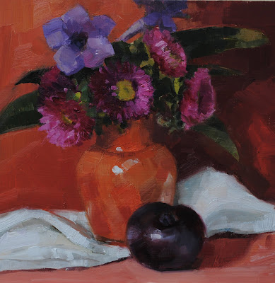
Asters in Orange Vase

Ai yi yi, the values, the values. I set this up in a close color range with lots of shadow to work on this issue. Color complicates value. I think I will have to do some of Liz Wilson's exercises, 50 value studies in 30 days and see if I can't jam this into my brain.

Monday, April 9, 2012

Cemetery Bluebonnets

It's really fun to get a riff going on an image, makes you want to see how many ways you can do it. These bluebonnets are a little straggly - their white tops are almost gone and there are only blossoms at the very top. I thought the season was about done but I saw lots on the side of the road when I was driving. I'm leery about picking where I can be seen though, do not want to get shot. May have to resort to snake filled ditches again this year.

Sunday, April 8, 2012

The Last Bluebonnets

The bluebonnets are on the wane here, only a few left and those look exhausted. I admit to poaching the yellow flower from the library beds early this morning. I think it is a kind of day lily, so it only had one day of glory anyway. These look like tiny orchids and float on long stems above the thin grass-like leaves. I was very economical with my brush strokes here, did not repair much in the process of painting it and mostly tried to leave the edges alone.

Saturday, April 7, 2012

Daisies in Square Glass

I kept this one in all grays and slathered on the paint again.